EN - This project was for Spellbound Publishing House, a hybrid book publisher dedicated to amplifying storytellers' diverse and unique narratives.
ESP - Este proyecto fue realizado para Spellbound Publishing House, una casa editorial dedicada a amplificar narrativas diversas y únicas.

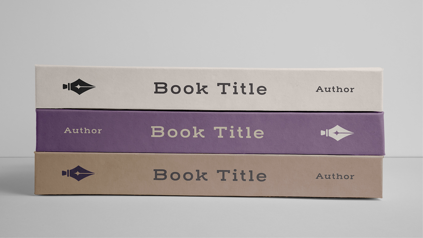
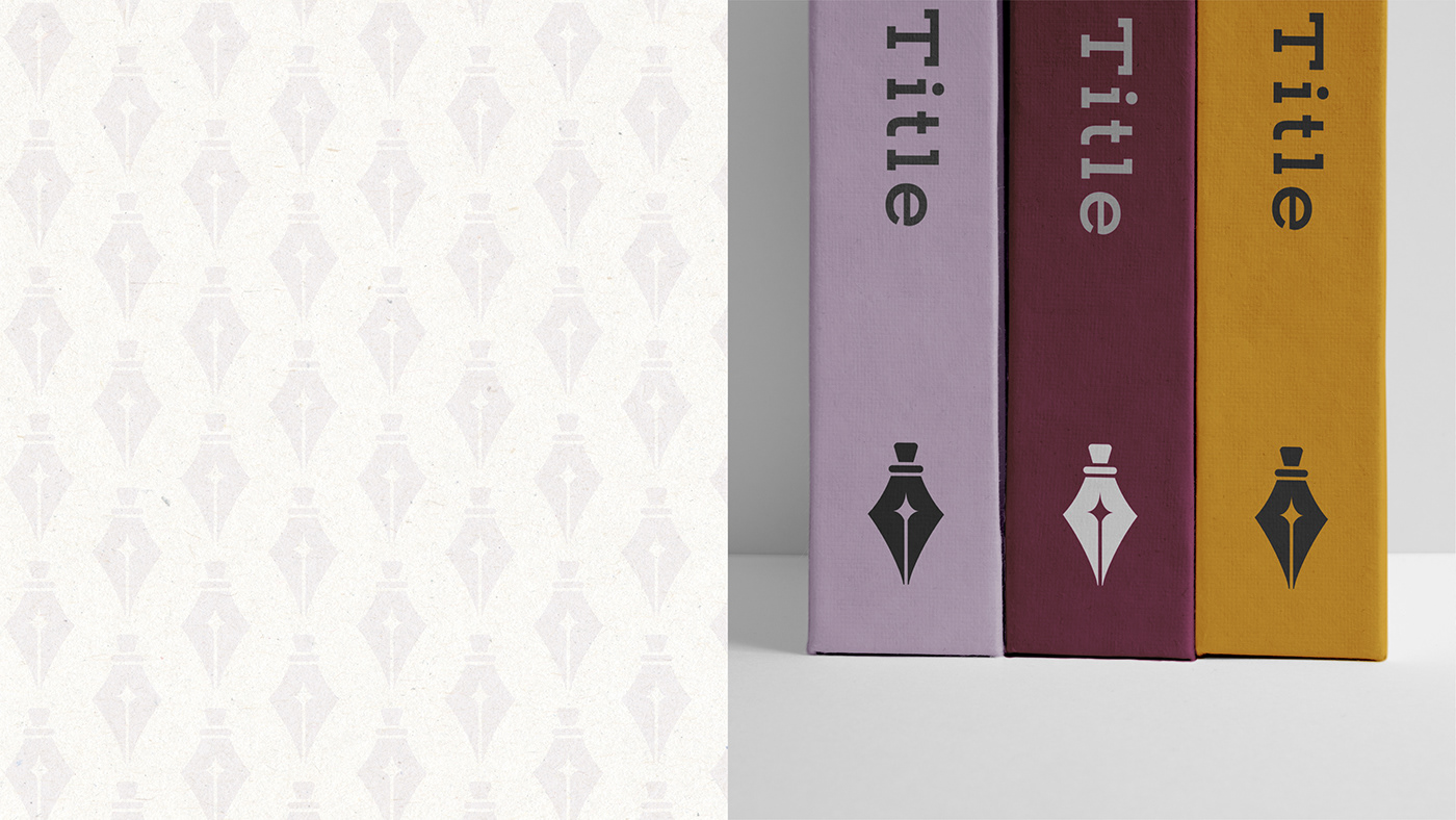
EN - The project focus was to create a logomark for the publisher. There were a few challenges, as the company had already settled on a specific aesthetic for its brand. Additionally, the logomark had to be versatile enough to be used on book spines and in small spaces.
ESP - El proyecto consistió de crear un símbolo para representar la editorial. Hubo algunos desafíos ya que la compañia ya tenía definido su estilo. También se tuvo que tener especialmente en cuenta el futuro uso del símbolo ya que debía ser suficientemente versatil para ser utilizado en los lomos de los libros y espacios pequeños.

EN - The final design is inspired by both a fountain pen iconography and a potion bottle. It conveys the idea of magic and writing while keeping a balanced and clean look.
ESP - El diseño final está inspirado por la iconografía de una pluma fuente y una botella de poción. Transmite los conceptos de magia y conserva un estilo simétrico y claro.